Armenian Birthday Patterns
I’m hoping this is the first of many posts, so I’ll start with something simple. A couple years back, I came across a chart on r/dataisbeautiful about birthday distribution in US. This inspired me to create a similar visualization for Armenia.
Before each election in Armenia, the relevant government bodies publish the lists of eligible voters. I used the data for the most recent Parliamentary elections of 2021 (these are general elections, so data is available across the country). I used Pandas to load all the data from multiple excle files into a single dataframe, clean and process it, and then plot the distribution as a heatmap using Seaborn. Finally, I used Illustrator to refine it.
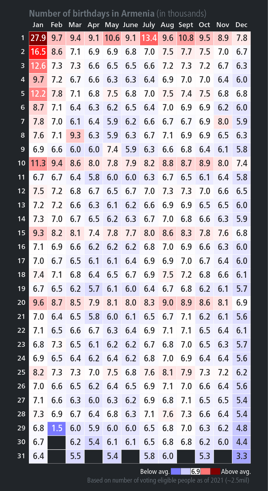
Several interesting patterns emerge from the chart. We can see that there is a below-average birthday distribution between March and June, as well as in November and December. At the same time, there’s a noticeable spike in birthdays on the 1st, 10th, 15th, and 20th of each month, as well as on Soviet holidays (Victory Day, International Woman’s Day). I suspect these unusual spikes can be attributed to the Soviet period, where either individuals or those responsible for registration may have preferred to shift actual birth dates to more “memorable” ones.
Going Interactive
These weird spikes have got me curious about how the birthday distribution changes between the pre- and post-Soviet eras and whether any correlation exists. I want to develop an interactive chart that will allow to explore the distribution across different years. This is currently a work in progress (so much new to learn), so stay tuned for the next update!